Add dimensions without losing responsiveness
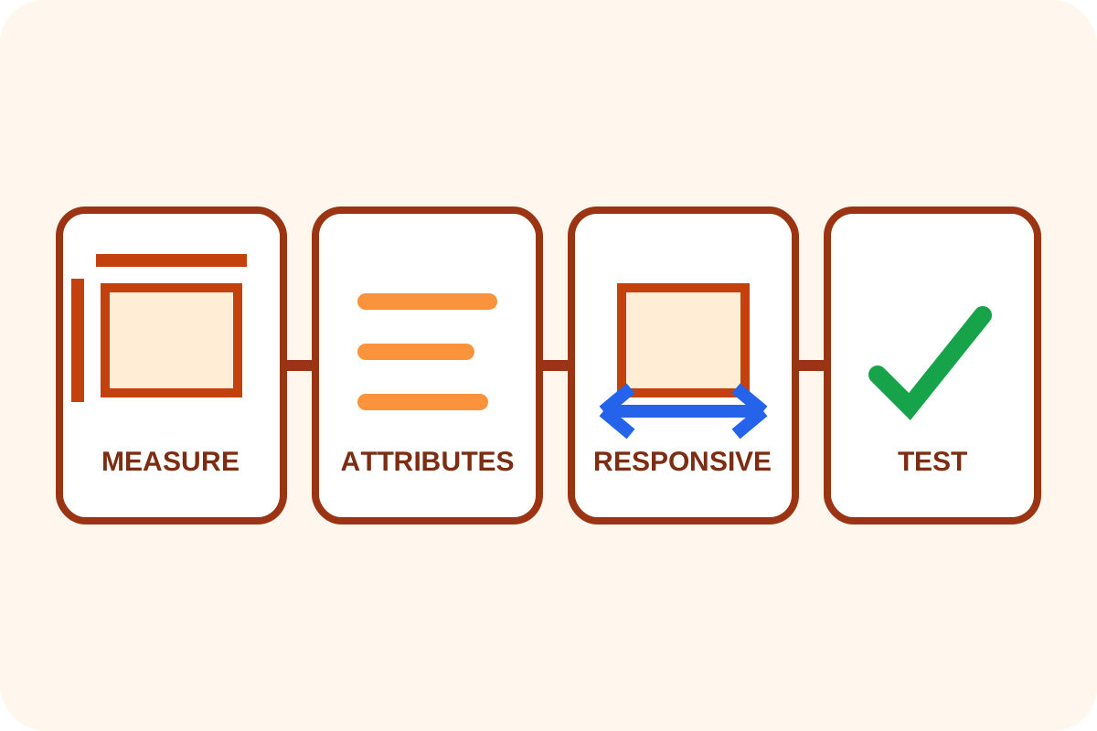
Read width and height from the source file or CMS metadata, output unitless numeric attributes and keep responsive CSS sizing. Repair the shared component, then test with image requests blocked.
Message for a developer
“For every recurring img, read intrinsic dimensions from the file or media library and output both numeric width/height attributes. Preserve responsiveness with max-width:100%; height:auto. Check all picture source ratios and reserve an appropriate container for art direction. Demonstrate cache-free and image-blocked desktop/mobile tests.”
What to prepare
- a template and media-configuration backup;
- examples of every image type and source files;
- representative pages at two viewport widths;
- current CSS rules for
img, its container andpicture.
Step-by-step repair
- Find rendered
imgelements missing either attribute. - Read pixel dimensions from the source or selected primary media variant.
- Add unitless numeric attributes whose ratio matches the image.
- Add or preserve
max-width:100%andheight:autowhere the image should shrink. - For width-descriptor
srcset, verifysizes; same-composition variants need one ratio. - For differently cropped
picturesources, reserve a breakpoint-aware container and useobject-fitwhen needed. - Repair the shared CMS component, clear caches and test newly created content.
- Block image requests and confirm layout space remains without horizontal scrolling.
Correct responsive example
<img src="photo-1200.jpg"
     srcset="photo-600.jpg 600w, photo-1200.jpg 1200w"
     sizes="(max-width: 760px) 100vw, 760px"
     width="1200" height="800"
     alt="A useful description of the image">
img { max-width: 100%; height: auto; }The attributes communicate a 3:2 ratio; displayed width may be 760px, 100% of the container or smaller.
Risks, rollback and separate work
An incorrect ratio can distort reserved space or create a new shift after load. Restore the template, clear caches and compare actual files. Never hardcode one dimension pair for dynamic images with different proportions.
Use the verification guide afterwards. Formats, compression, lazy loading, LCP, backgrounds and third-party widgets are separate. For a complex generator, order the repair.