How to avoid loading desktop-only elements on mobile
Do not begin with PHP phone detection. Identify what is unnecessary—pixels, iframe, module, API or the entire component—then apply a browser or server mechanism with a testable fallback.
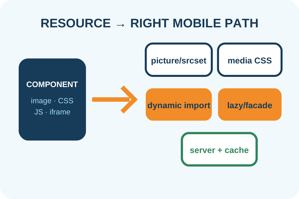
The safest route
Message for a developer
“Compare mobile/desktop Network and DOM for the hidden component. Preserve meaning through a light mobile alternative. Use picture/srcset for images, media rules for backgrounds, matchMedia with conditional import and cleanup for JS, and fallback plus correct Vary/cache key for server variants. Prove requests are absent, not only display:none.”
Back up templates, CSS/JS entry points, current screenshots and journey list. Record control viewports and resize/orientation behavior; work in staging.
Implementation steps
- Open mobile viewport before loading, clear cache and record HAR. Find hidden-component requests and their initiators.
- Decide whether removal would lose information, navigation, forms, advertising or legal text.
- For one image at several resolutions use
srcset/sizes; for different compositions usepicturewith fallback. - Declare backgrounds only inside the matching media query and remove unconditional desktop-background preload.
- Do not import heavy JS on mobile. A light bootstrap evaluates media, imports on desktop and cleans up when mode changes.
- If the server sends different HTML, do not trust User-Agent alone: provide a default/fallback, Client Hints where available and correct CDN cache separation.
- Repeat cold load, resize, orientation, back/forward, keyboard and critical journeys in both layouts.
Technical examples
Conditional JS initialization
const query = matchMedia('(min-width: 64rem)');
let cleanup;

async function sync() {
  if (query.matches && !cleanup) {
    cleanup = (await import('./desktop-slider.js')).mount();
  } else if (!query.matches && cleanup) {
    cleanup(); cleanup = undefined;
  }
}
query.addEventListener('change', sync);
sync();
Responsive image
<picture>
  <source media="(min-width: 64rem)" srcset="hero-wide.webp">
  <img src="hero-mobile.webp" alt="Description"
       width="720" height="900">
</picture>
If mobile should show no image, avoid an unnecessary transparent-pixel workaround: omit the optional component from that branch and preserve its alternative meaning in HTML.
Risks and rollback
| Symptom | Cause | Action |
|---|---|---|
| Desktop module remains in mobile bundle | Static import or shared entry | Use a separate dynamic chunk |
| Two sliders after rotation | No cleanup/idempotent mount | Add teardown and guard |
| CDN sends wrong variant | Incorrect cache key/Vary | Roll back variant and fix cache |
| Important mobile feature disappears | Component misclassified as decorative | Restore a light accessible alternative |
To roll back, restore the shared template/entry, purge affected cache and repeat both layouts. Then perform the independent audit. Full redesign and global bundle refactoring are separate work.